Role
Team
Timeline
Platform


The Problem
Traditional recipe apps lack cultural context, leaving home cooks with a lack of connection with the global heritage and cultural journey of their food.
The Solution
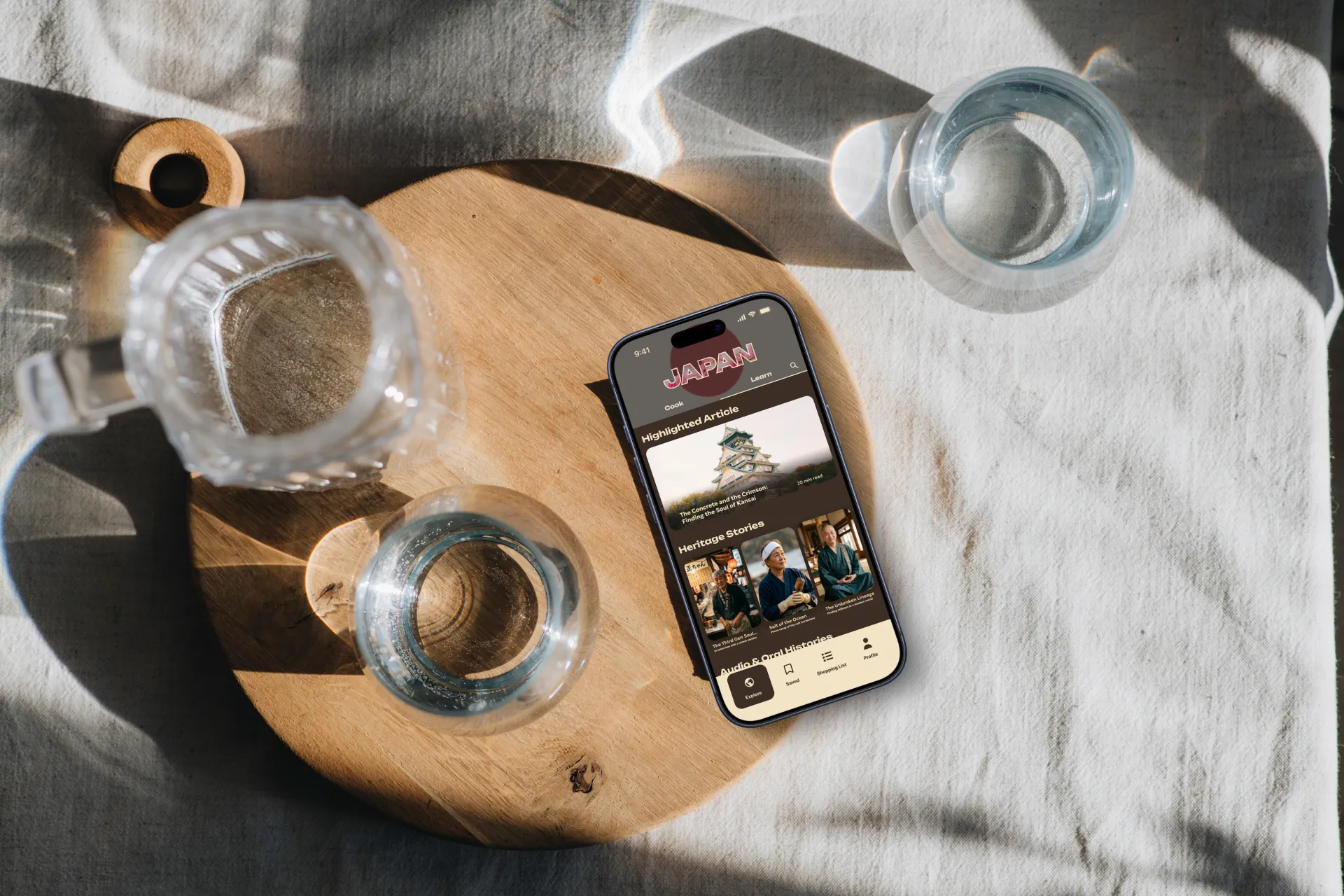
A map-centric mobile experience with two core flows, Cook and Learn, so users can cook a recipe and understand the world it came from.
My Impact
Led the full design cycle. Owned 95%+ of the UI. Pioneered a custom AI-driven workflow for authentic imagery and bespoke design tools.
The Problem
Home cooks are outgrowing recipe apps.
Three food-lovers asked themselves a question at the start of 2026: why does it feel like there's a gap in the food-education space? People cook at home regularly, often inspired by global travel. Yet the apps they reach for, with their timers, ingredient lists, step-by-step guides, fancy AI features, tell them nothing about why a dish matters, or what it means to the people who've cooked it for generations.
We asked ourselves: What if we created an app that made people feel like they were travelling the world through their kitchen?
How might we foster a deeper connection between home cooks and global cultures by centring recipes around their historical and regional roots?
Research
We spoke to real food lovers
I led the interview guide, refined it after the first batch of interviews, and ran subsequent interviews. I also designed and distributed the broader survey to 30+ participants to gain an organic picture of how people feel when they cook and what they cook.
Affinity mapping across all data narrowed us down to several key insights that directly informed our design decisions.
said cultural context is important to their enjoyment of food
cook at home 3–5 times a week
participants surveyed and interviewed
Competitive analysis of the iOS App Store's most popular 20+ cooking apps told us: existing platforms fail to combine cultural storytelling and regional discovery in a meaningful way.
Design Process
Double Diamond, start to finish.
Over 13 weeks I drove the team through both halves of the Double Diamond, moving between collaborative workshops and individual design ownership.
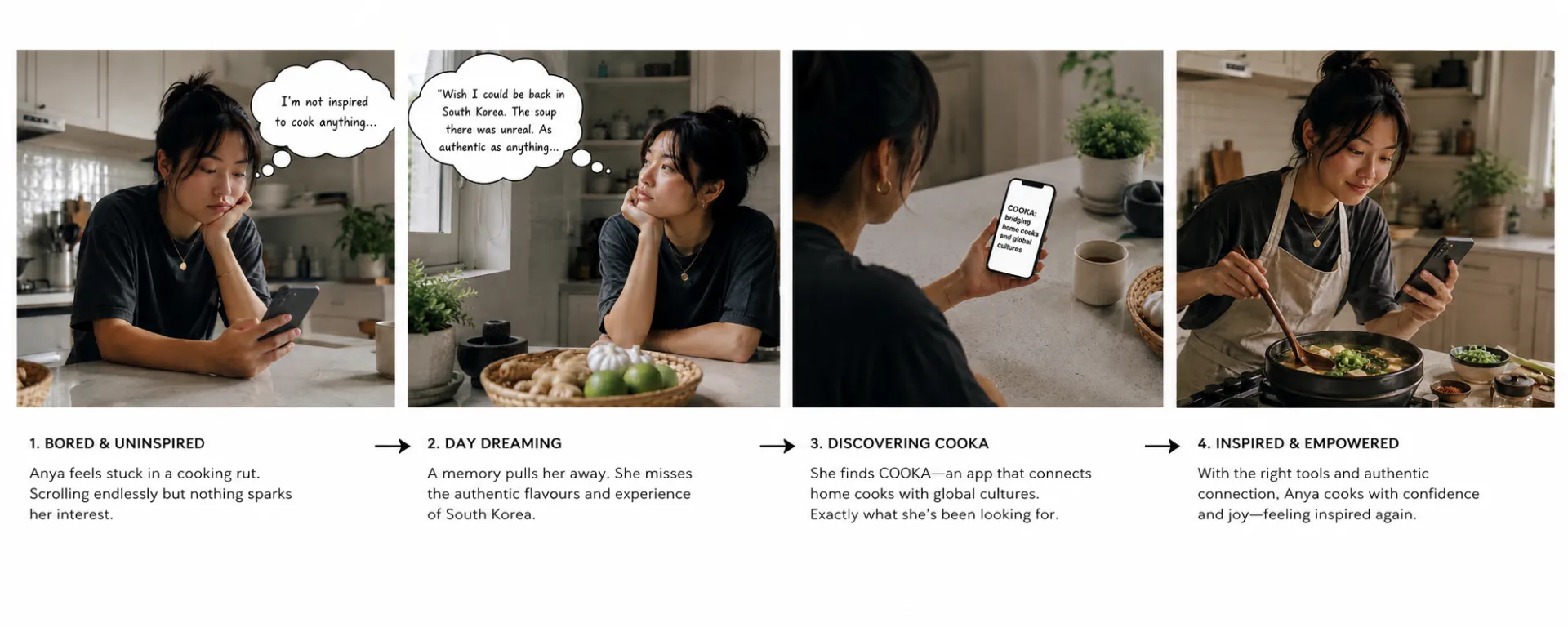
We used AI to synthesise research notes into a persona for "Anya", who would become our constant reference throughout the project.
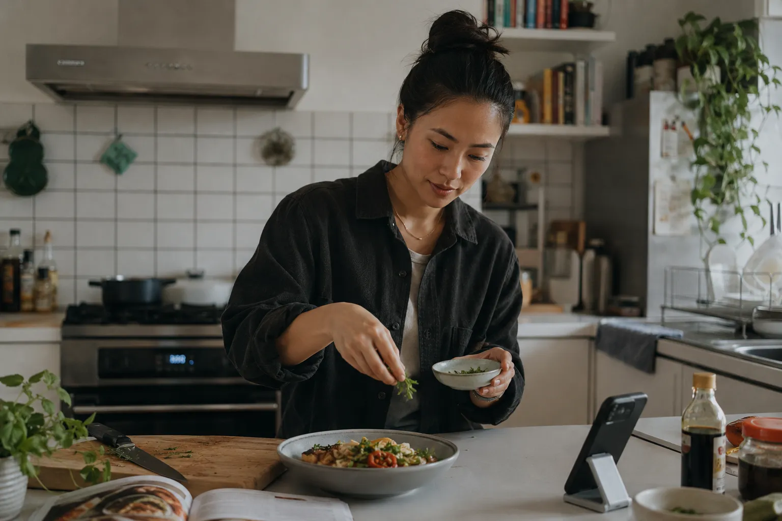

An exercise in stepping outside of our own biases and inhabiting the mindset of a user who isn't me.
Mapped a day in Anya's life to identify the natural moment when COOKA would earn a place in her routine.
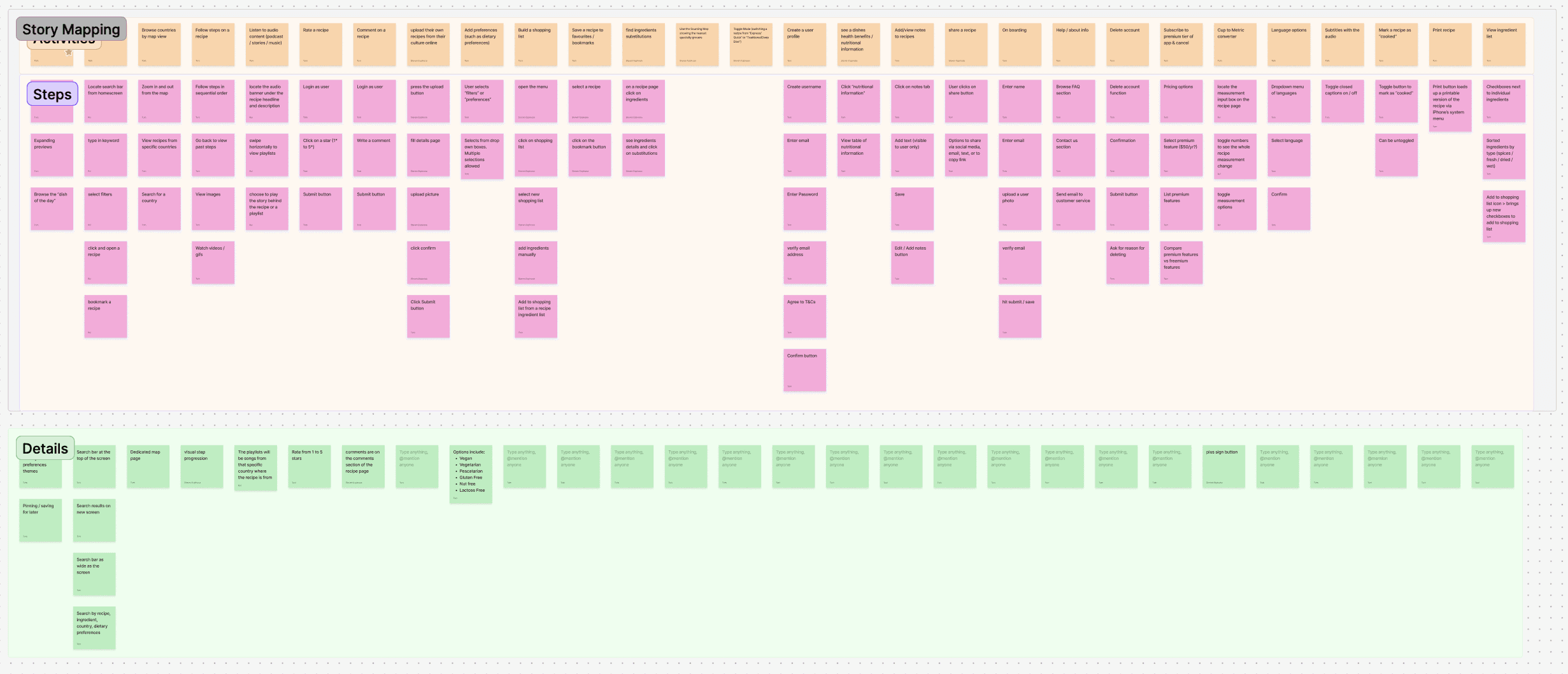
I led the group in building a full story map, then ran a MoSCoW sort to isolate must-haves for our MVP.
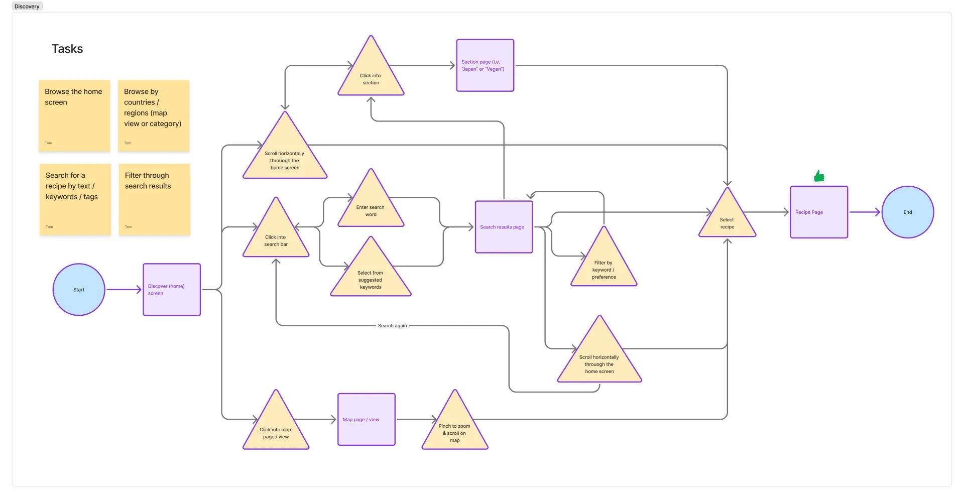
Wire-framed three critical flows: Discover content, Explore a recipe, and Cook a meal.
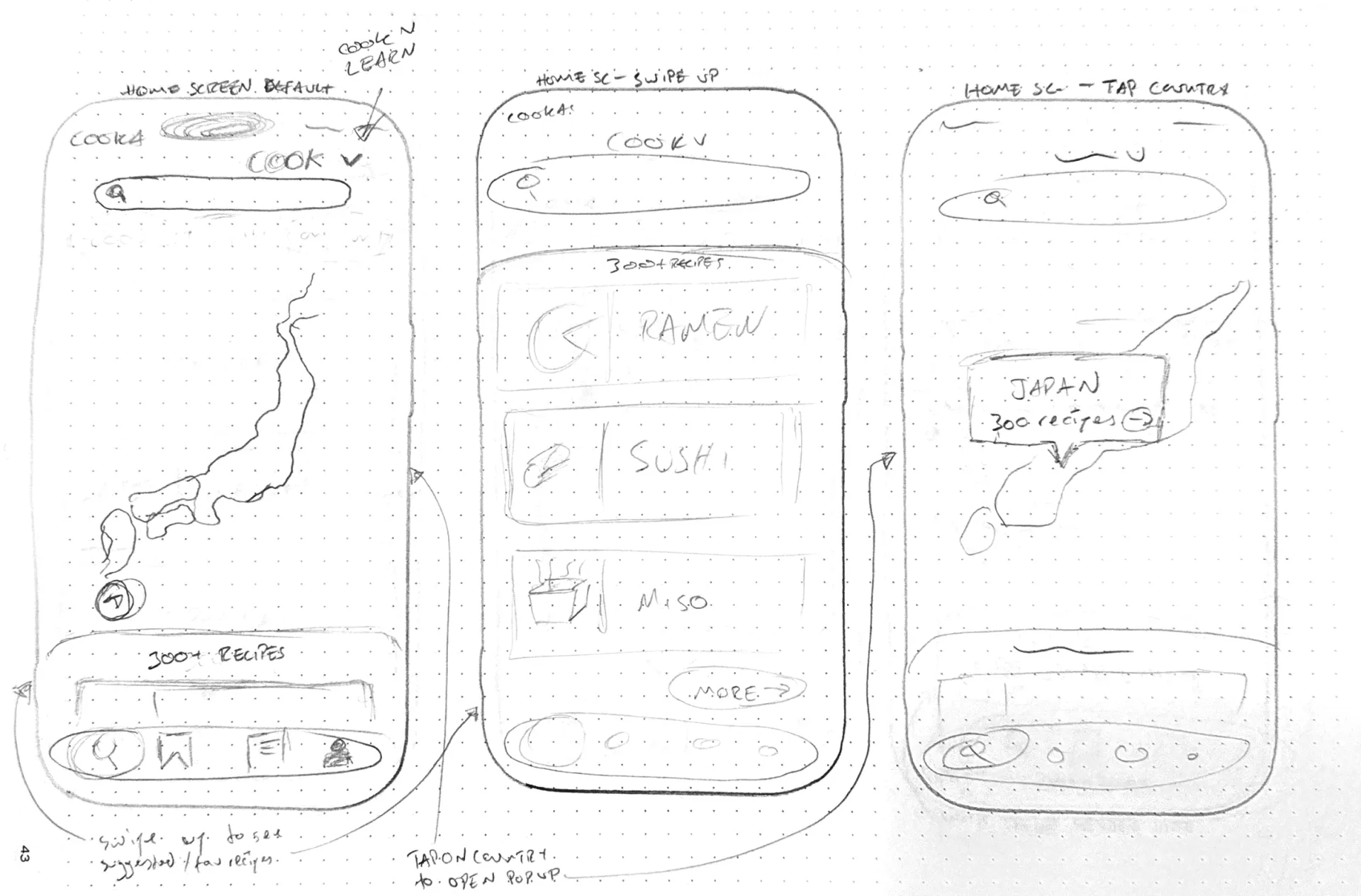
First to sketch initial designs, drawing from All Trails and SoundCloud. Moved into Figma early to establish spacing and style.
AI Integration
Building the tools I needed.
Throughout the Double Diamond process I used generative AI sparingly and primarily as a learning assistant and data analyst, to ensure I was building good habits and exercising mental muscles. Once the research and structure were in place, I stepped into a Creative Director role and used AI precisely where it unlocked something I couldn't do otherwise.
Claude Code
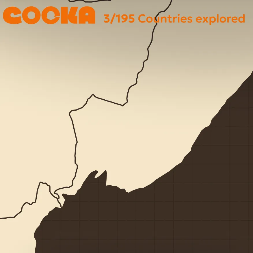
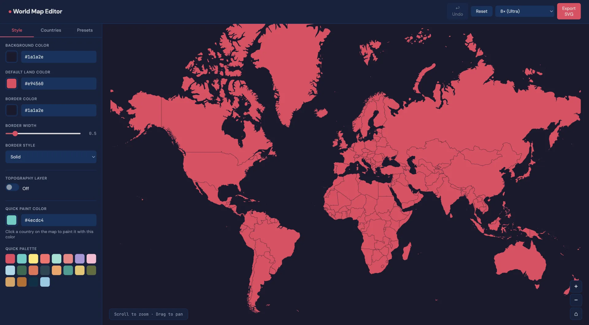
Custom map builder
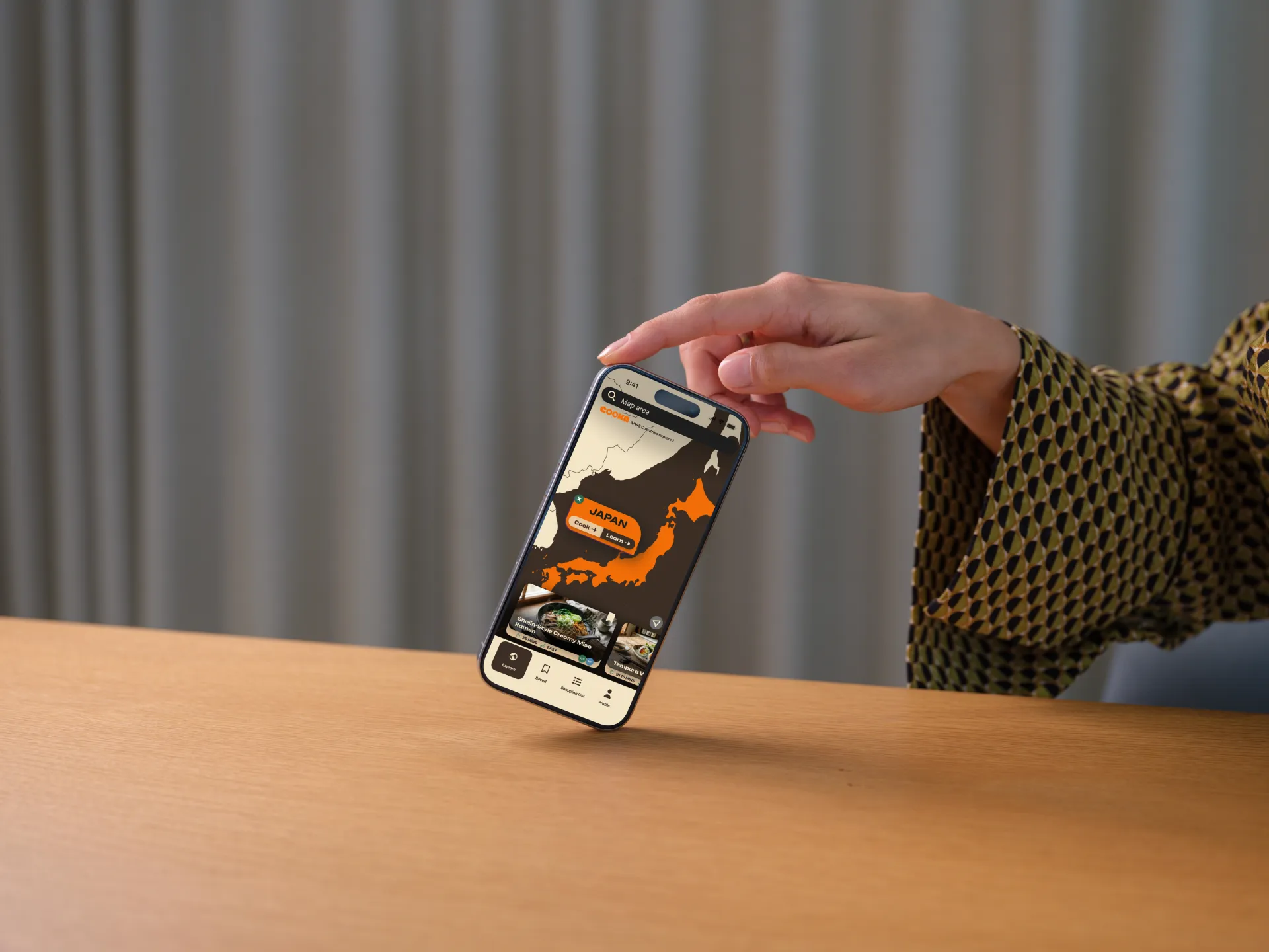
The maps I found online weren't the right colours. I used Claude Code to build a custom world map creator: full colour control, hi-res SVG export, layers named by country.
Nano Banana &
ChatGPT Images 2.0
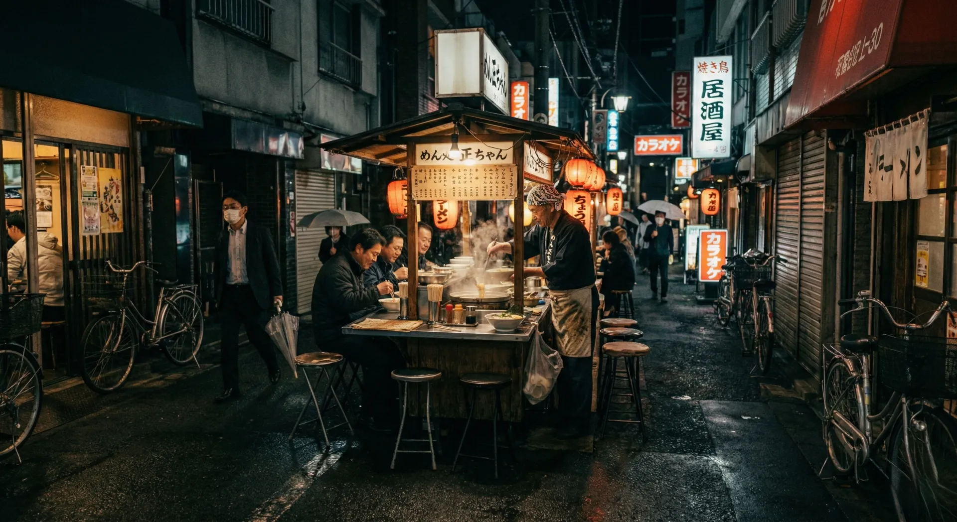
Authentic imagery
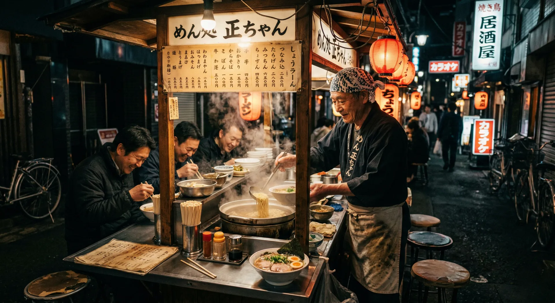
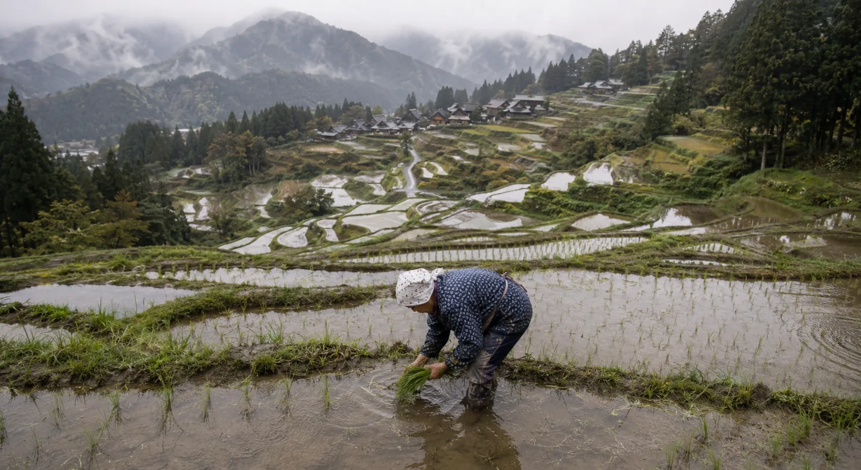
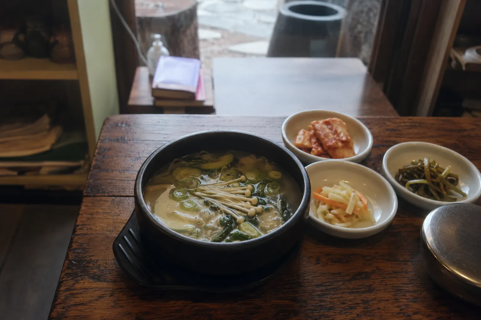
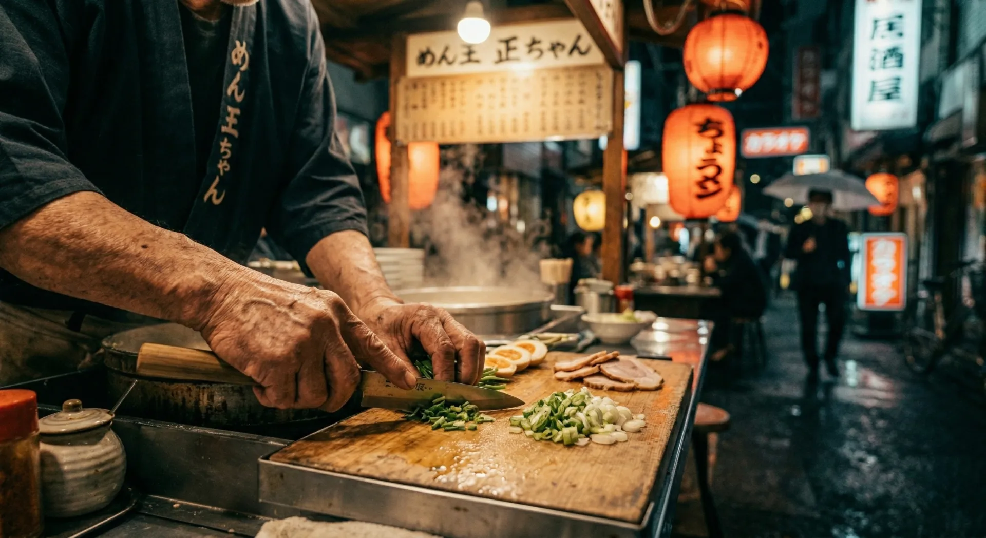
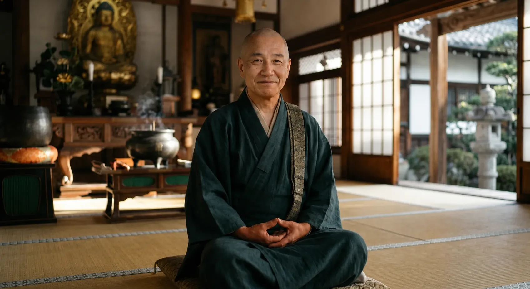
Drawing on my photography background, I prompt-engineered high-fidelity food and cultural portrait imagery, using specific reference material and lighting cues to match Anya's world.

Visual Design
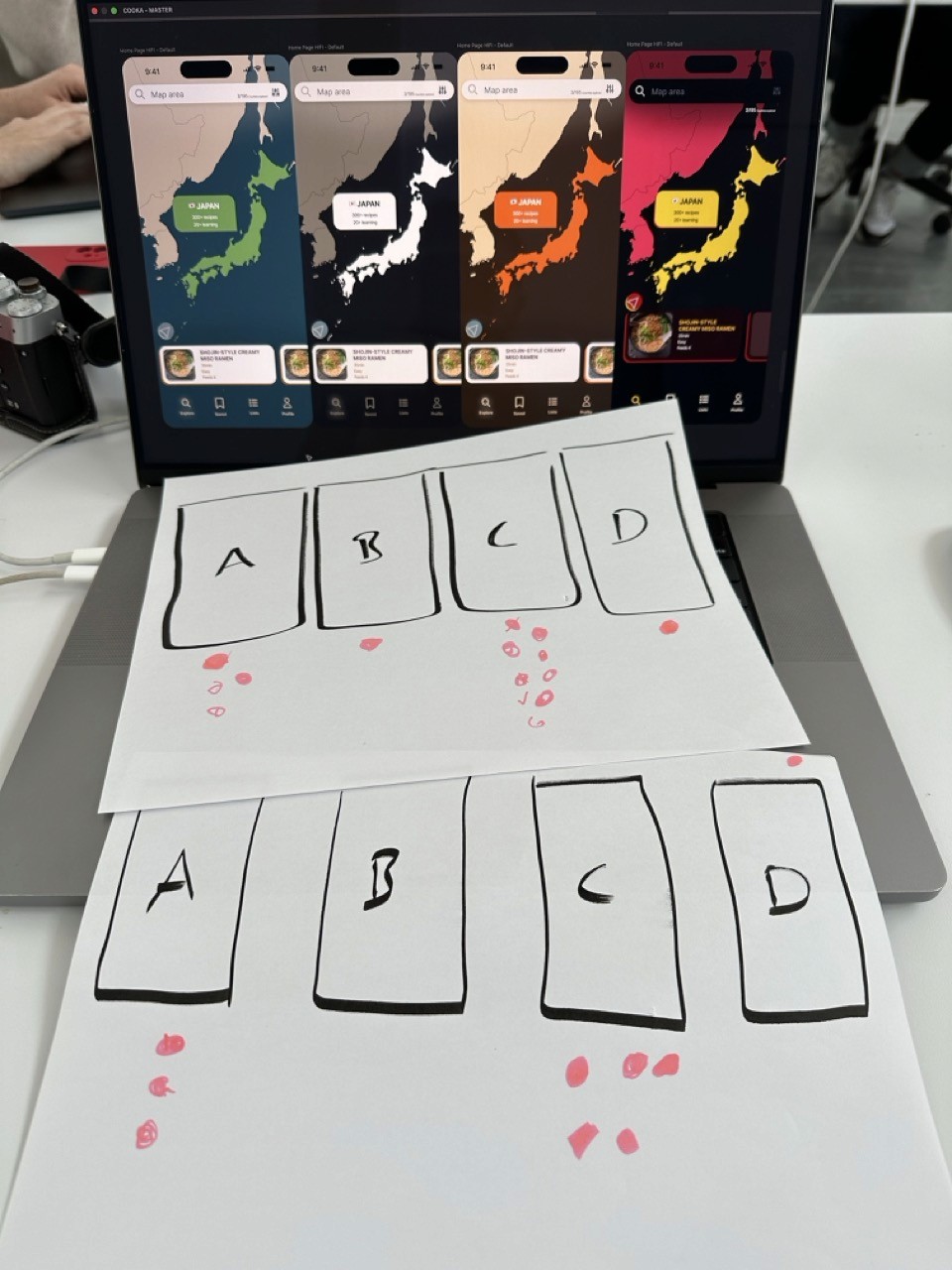
From mood board to "Orange Mocha."
My initial designs leaned towards the heavily styled and early testers said the visual treatment was competing with the food itself. I mocked up three additional visual directions and ran a simple preference test: "Which of these feels like a worldly cooking app?"
'Orange Mocha' won decisively. That became the pivot point that finally gave the team a shared, buildable direction.
Final Designs
The two primary flows
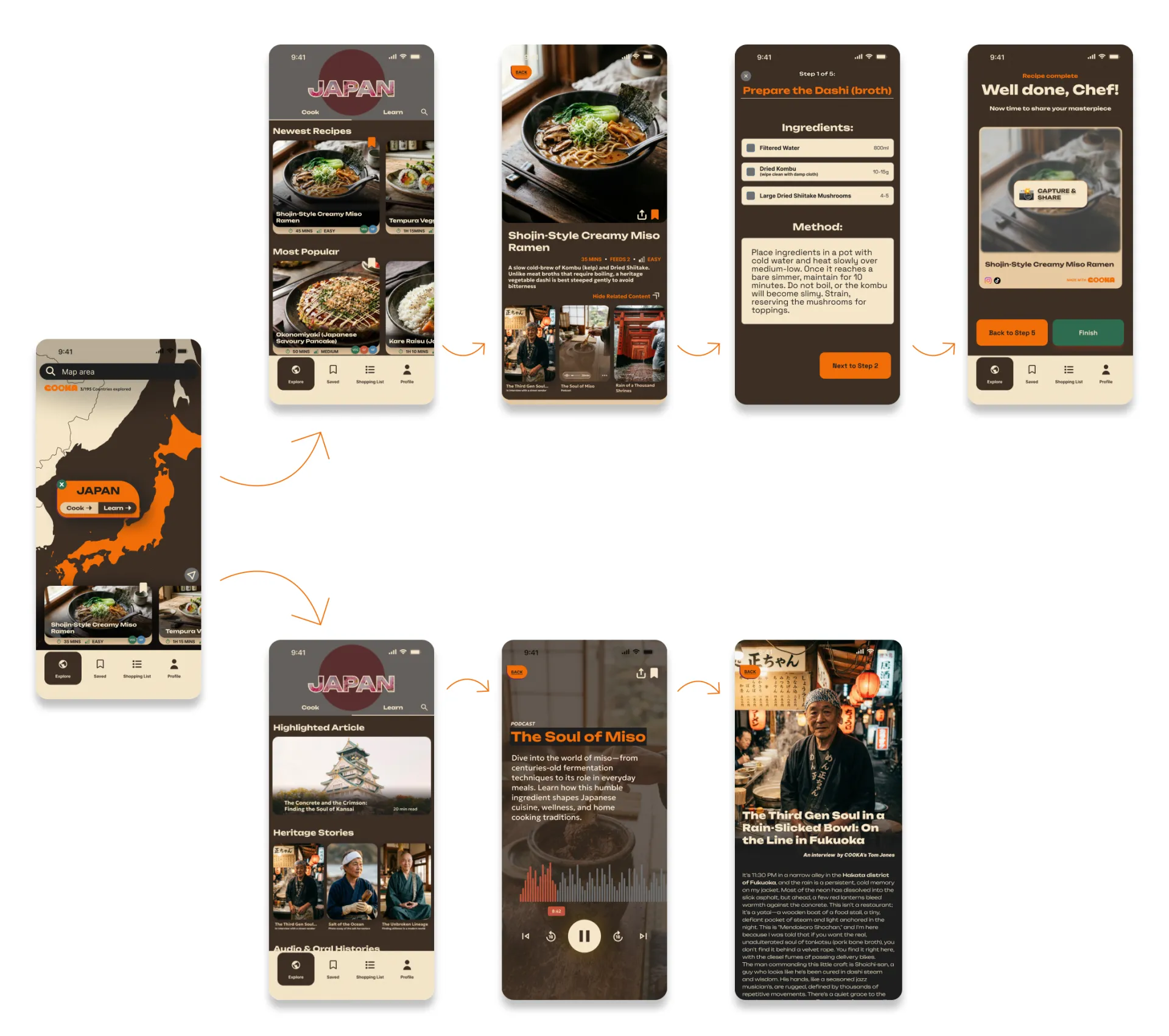
There are two primary flows available to the user;
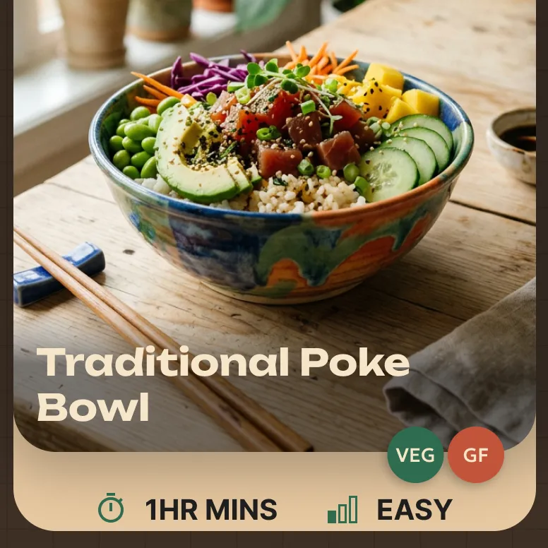
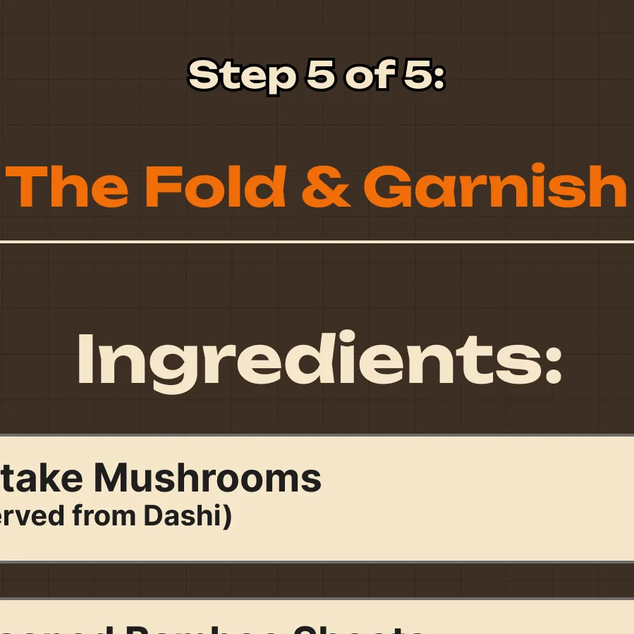
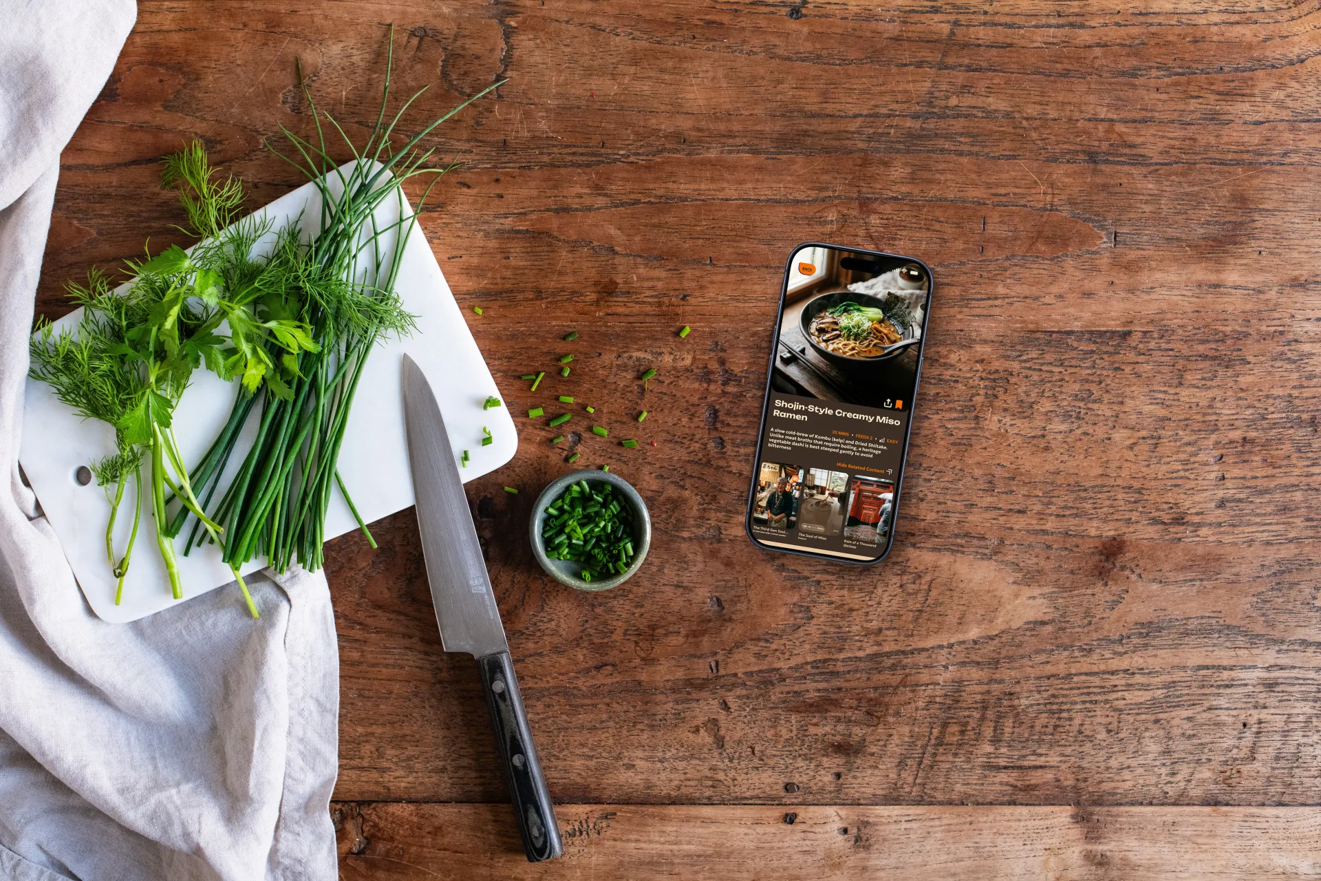
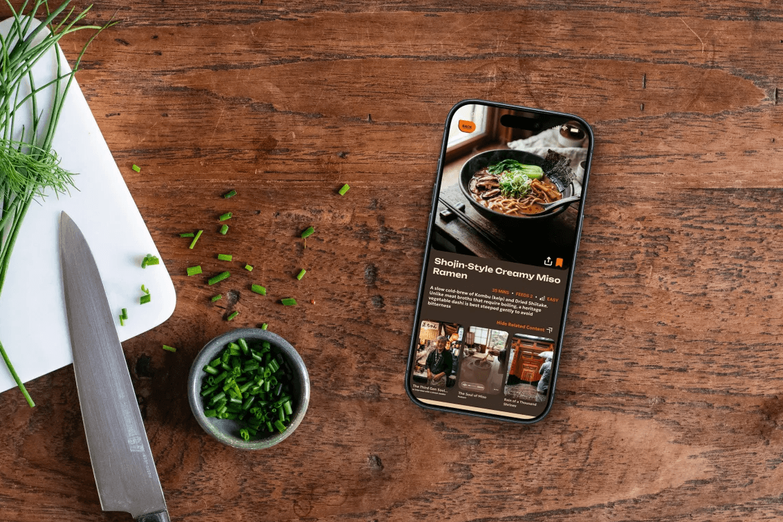
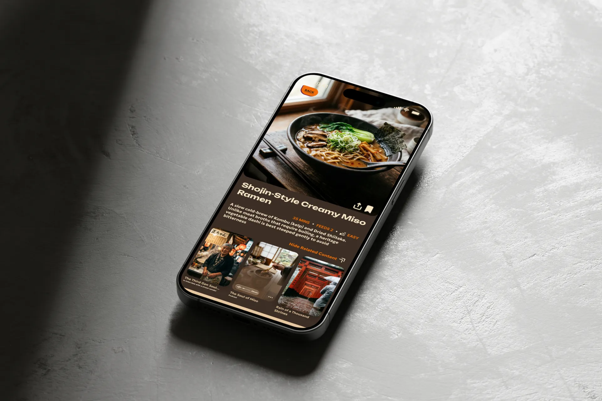
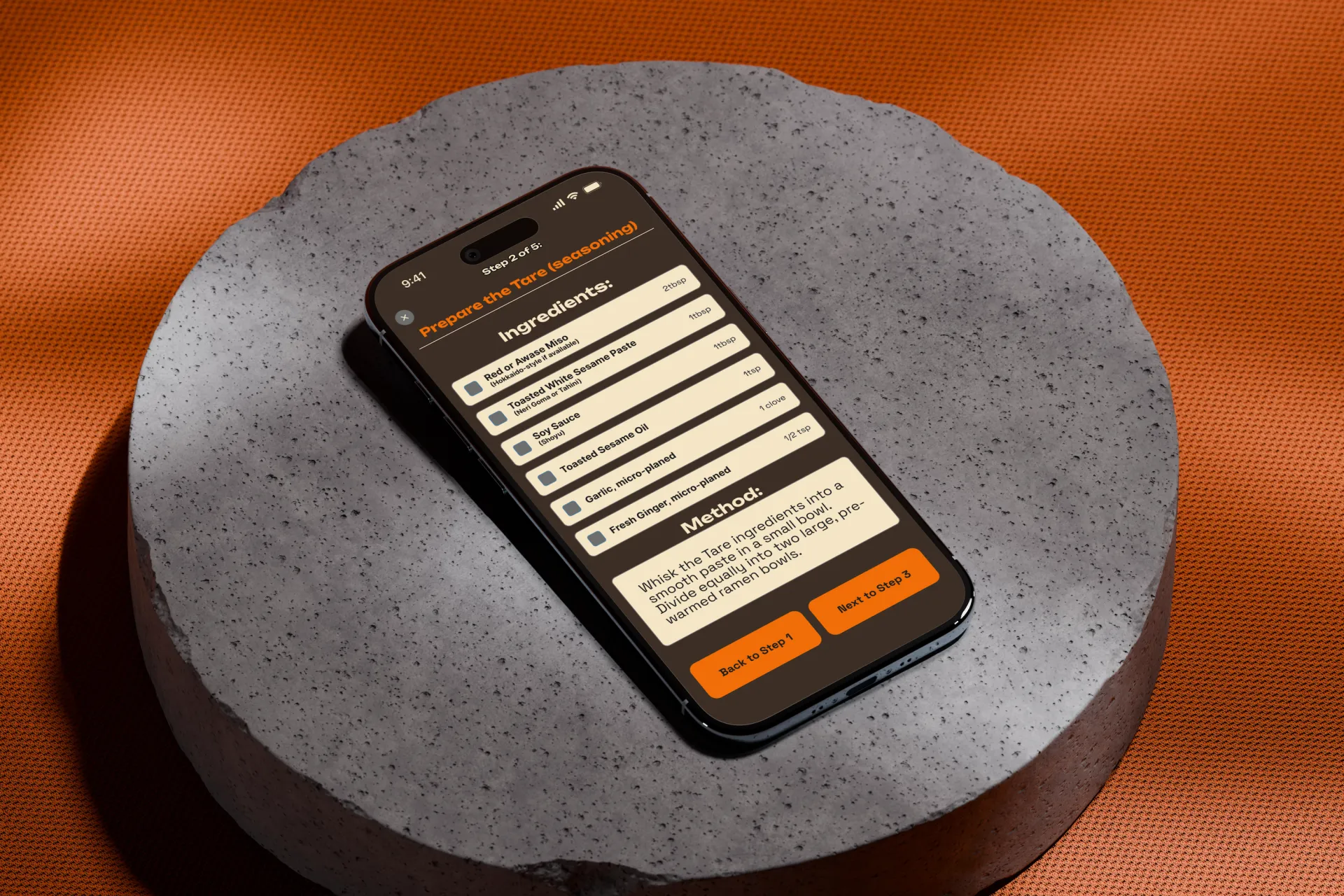
Cook a meal flow: The user browses a collection of recipes, clicks through to explore a recipe and see related content, then enters "Cook Mode" to see minimal step-by-step screens with method and ingredients.
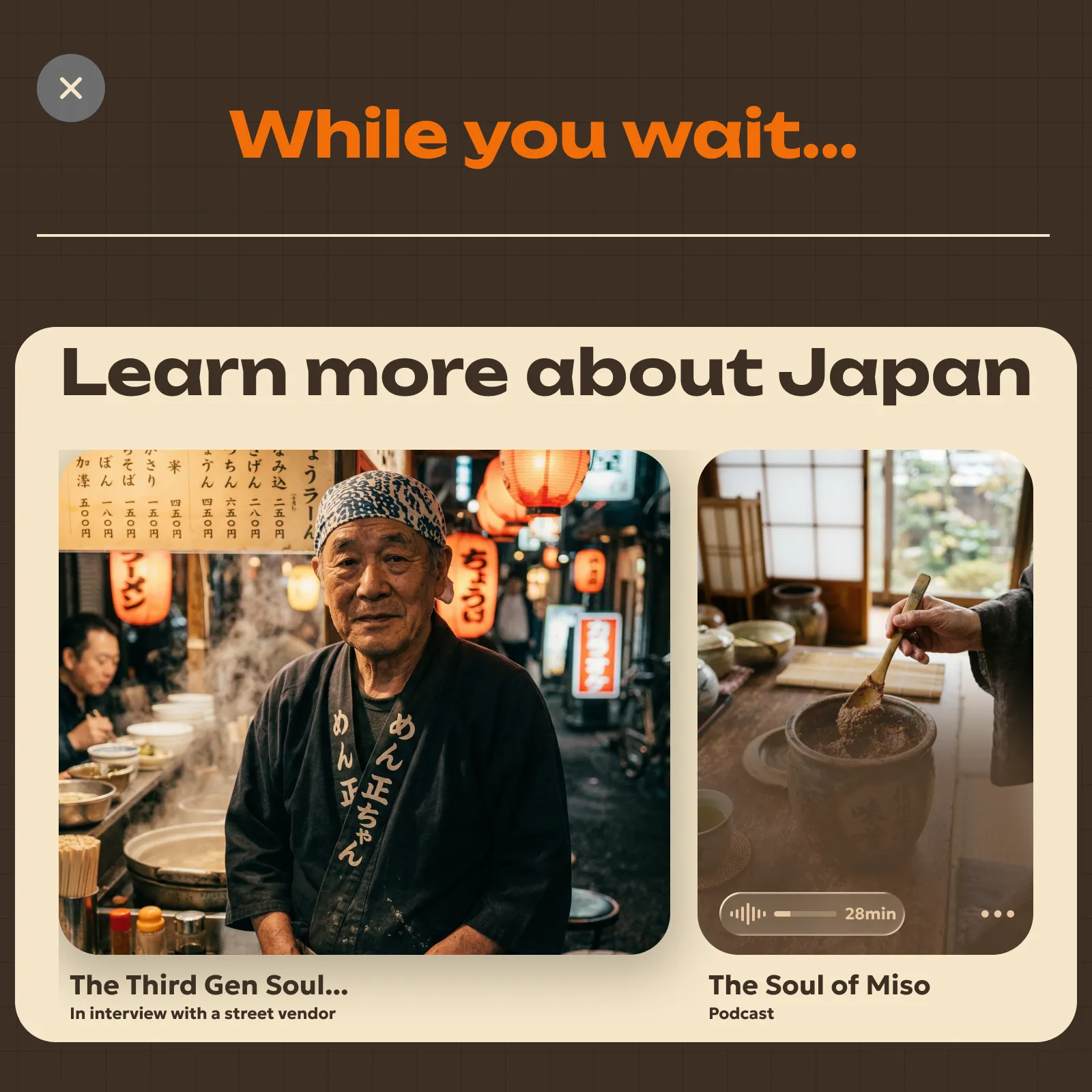
Explore content via Learn tab: Here the user finds articles, images, podcasts, and more, all related to the region selected and the meals being prepared.
User Testing
What real users thought
Several rounds of usability testing on the final designs with participants from our target demographic. Here's are the issues that surfaced, and how I responded.
Timing & difficulty weren't visible enough
Users wanted cook time and difficulty directly on the recipe card. Added those fields to the card surface.
Cultural articles were buried
Users wanted quicker access to Learn content. I added a dropdown "related content" section on the recipe page.
Ingredients & Method tabs felt disconnected
A previous iteration placed the search bar alongside these tabs; it didn't fit semantically. Separating them resolved the confusion.
Design in the Details
Design decisions a sharp eye will notice.