Overview
If you see a physio, massage therapist or speech therapist who doesn't bill your insurer directly, you pay up front and then claim the money back yourself. Lots of people don't. The receipt goes in a drawer, the deadline slips past, and money they're entitled to never comes back to them.
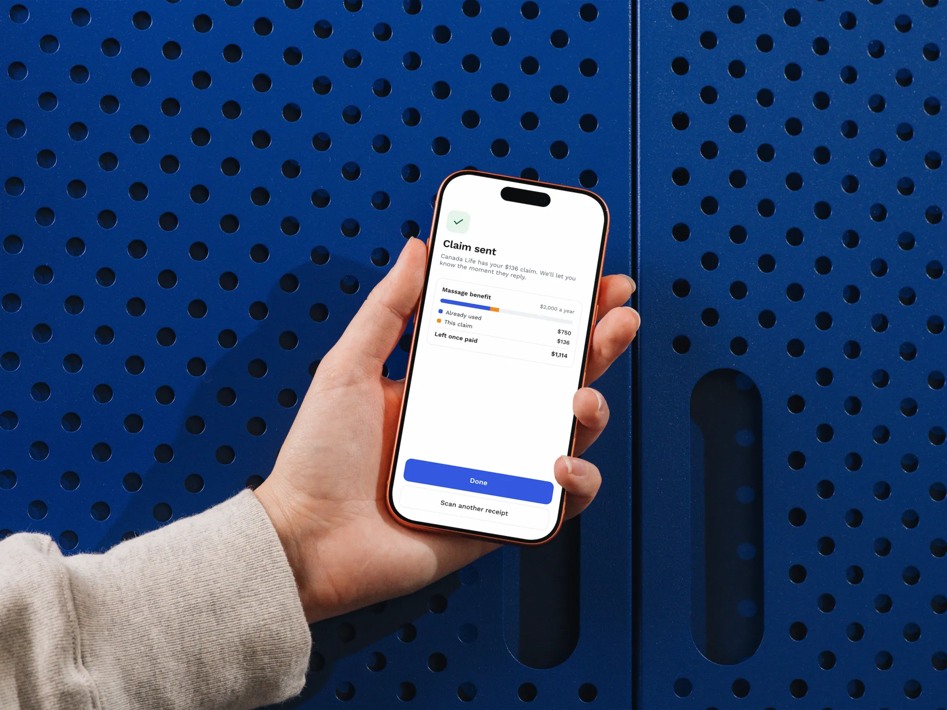
Reimburse.Me is a mobile app concept that makes that claim quick enough to do on the walk back to the car. You scan the receipt, check what the app pulled out, and submit. The app then keeps you posted until the money lands.
I led product and UX, which meant turning a messy, fragmented process into a flow that felt simple and trustworthy, and making the calls on what made it into the MVP.
Problem Statement
Submitting receipts for insurance reimbursements is time-consuming and repetitive.
Users regularly delay or skip submissions altogether, leading to financial loss, frustration, and reduced use of the healthcare services they are entitled to.
We started out targeting anyone with extended benefits, then narrowed to parents and caregivers. They juggle recurring appointments for several people, so the friction compounds fast. We focused on families with recurring claims like physio, speech therapy, mental health and orthodontics rather than one-off claims.
What we heard
Through interviews and a survey, a few patterns came up again and again:
Receipts get "shoeboxed." One participant described procrastinating until deadlines passed, especially when there were mental barriers to starting.
No single source of truth. Another lost track of what had been submitted versus what was still pending, and rated the financial impact 7 out of 10.
Manual entry is tedious. A third found typing out receipt details and scanning documents in their insurer's app slow, partly because it couldn't upload automatically.
The reframe
The biggest shift for me came in week four. We stopped treating reimbursement as an admin task and started treating it as an emotional one. Parents talked about guilt ("I keep forgetting"), stress and a sense of failing at something that should be easy. That changed the brief. We weren't just building a faster form, we were building something that would help people feel on top of things.

Key Design Decisions
01- Designing every state, not just the happy path
AI extraction isn't instant, and it isn't always right. Early on we assumed a fully automated flow. I pushed us toward a human-in-the-loop approach instead, because people won't trust a black box with their money.
That meant designing each moment of the scan explicitly:
Uploading the receipt
Reading it, so people know something is happening
Analyzing, with results sorted into clear categories (insurance versus wellness)
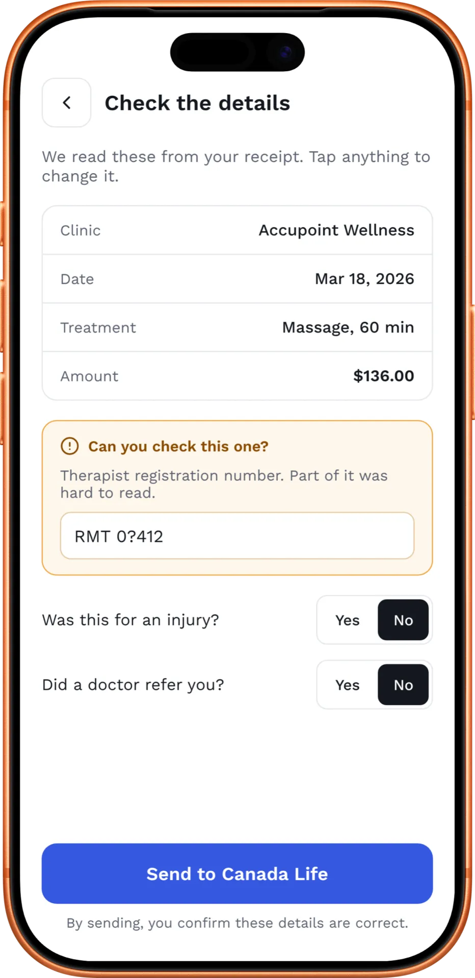
Confirming, where the user reviews and edits what the app extracted before anything is submitted
Each state answers the question the user is silently asking at that moment. The confirmation step was the most important one. It catches extraction errors and gives people the final say.
02- Words that don't sound like insurance
Insurance language is cold and a bit intimidating. We used human language throughout, so the main action reads "Let's get your money back" rather than "Submit your claim," and we dropped jargon like "Policy Holder."
The harder question was error states. A denied claim is a stressful moment, and an upbeat tone can easily feel dismissive there. We flagged this as a risk to work through rather than pretending one voice fits every situation.
03- Built for interupted days
Parents rarely get five uninterrupted minutes. So every scan saves automatically as a draft, and the flow is designed to be finished in short bursts. If a toddler needs you halfway through, nothing is lost.
We also used progressive disclosure rather than one long submission form, so people only see the detail they need at each step.

04- Keeping status visible after submission
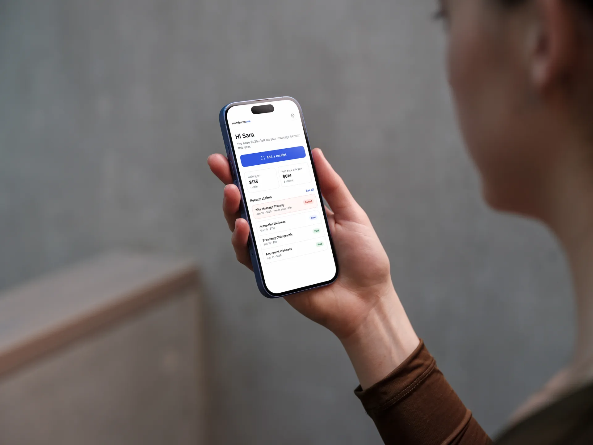
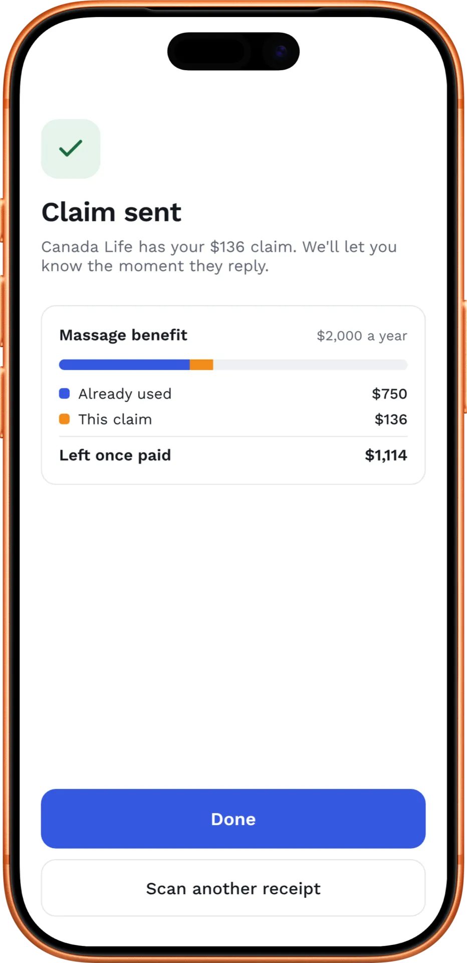
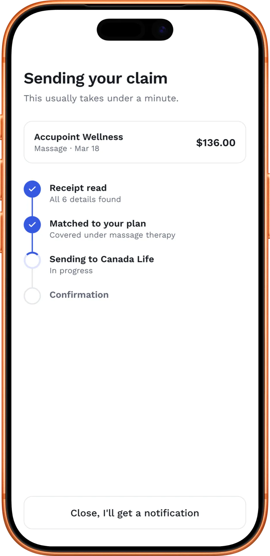
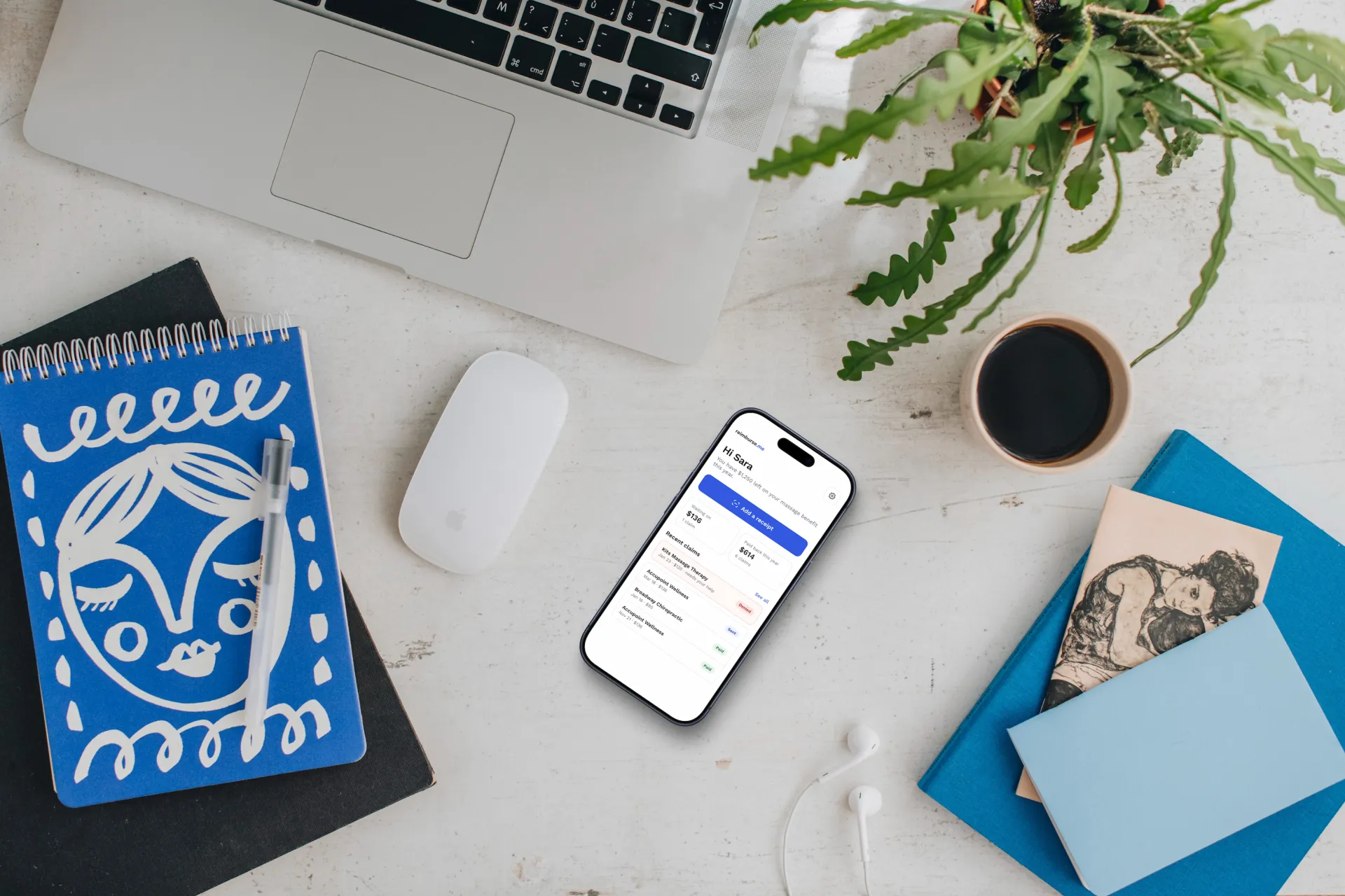
The anxiety doesn't end when you hit submit. A recurring frustration was not knowing what happened next. The MVP includes claim status tracking, a simple history view and notifications for updates and reminders.
Reminders raised a real tension we kept coming back to: will people feel helped, or nagged? Getting the frequency and tone of those nudges right was one of the open questions I'd most want to test.
04- A small system to keep things consistent
Alongside Ana's brand work, we built a component library of icons, buttons and card layouts, guided by three brand pillars: Frictionless, Anti-Bureaucracy and Visible Progress. Having shared patterns early meant new screens felt familiar, and kept us from drifting as the prototype grew.


Scoping the MVP
Deciding what to leave out was as important as what went in.
In the MVP: receipt scanning with the camera, AI autofill with a manual review step, submission to a small number of major insurers, basic status tracking, a claim history dashboard, single-user accounts, and reminder notifications.
Left out on purpose: family accounts and shared dashboards, benefit balance tracking across all plans, fully automated one-tap submission, and integrations with every insurer.
Cutting family accounts was a tough call, since families were our core audience. But shared access raised real privacy questions (how do two co-parents share a child's claims without seeing each other's medical history?) that needed more research than we had time for. The aim of the MVP was narrower: find out whether people consistently submit claims once the friction is gone.
The clinic side of the story
One of the most interesting threads didn't make it into the prototype. In week three we shifted from focusing purely on scanning to looking at the handoff, meaning how the receipt gets from the practitioner to the patient in the first place.
If the clinic could share claim-ready details at checkout, maybe through something like a QR code, the patient wouldn't need to scan anything at all. We never got to test whether clinics would want to do that. It's the part of the problem I'd most like to explore further, because it treats claiming as part of the relationship between a clinic and its patients rather than a chore the patient handles alone.

Working as a team
We were three people with clear lanes. Madison led business and strategy, kept us accountable with weekly check-ins, and contributed a lot to the prototype. Ana owned the brand, the visual direction and the pitch slides. I owned the product and UX direction, turning research into flows and making the scoping calls.
Because we aligned on the problem early, we rarely had to rework our direction. The weekly log also helped me see where my design decisions connected to the business model and the pitch, which is a link I now look for on every project.
What I'd do differently
Test with real people, sooner. Time pressure meant we didn't test the prototype with users as much as I'd have liked, so several decisions remain unvalidated. I'd want to watch people go through the scan and review flow and see where trust breaks down.
Talk to clinics. We designed almost entirely from the patient side. I'd want to sit with front-desk staff and practitioners to understand the receipt handoff from their end.
Ground the integrations earlier. Insurers have no standard APIs and little incentive to make claiming easier. That shaped what was realistic, and I'd bring a developer into those conversations from the start.
Reflection
This project taught me that the most useful products often don't create new behaviour, they make existing behaviour much easier. People already wanted their money back. The job was to remove what was in their way, and to design each small moment so it felt calm and trustworthy rather than bureaucratic.

people report not understanding their coverage at all.