Role
Timeline
Platform
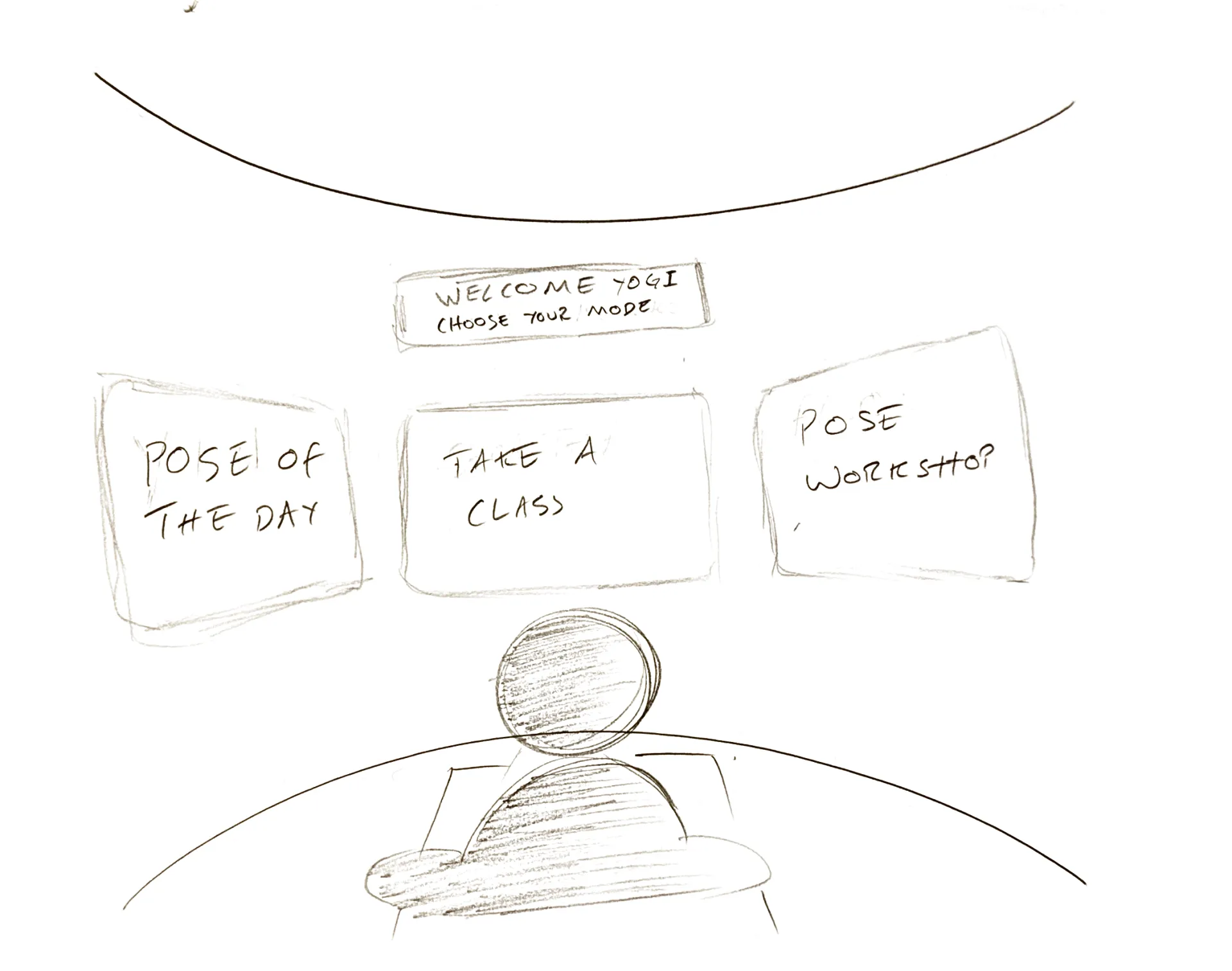
Redesigning the home yoga experience through spatial computing to transform "guessing" into "feeling."
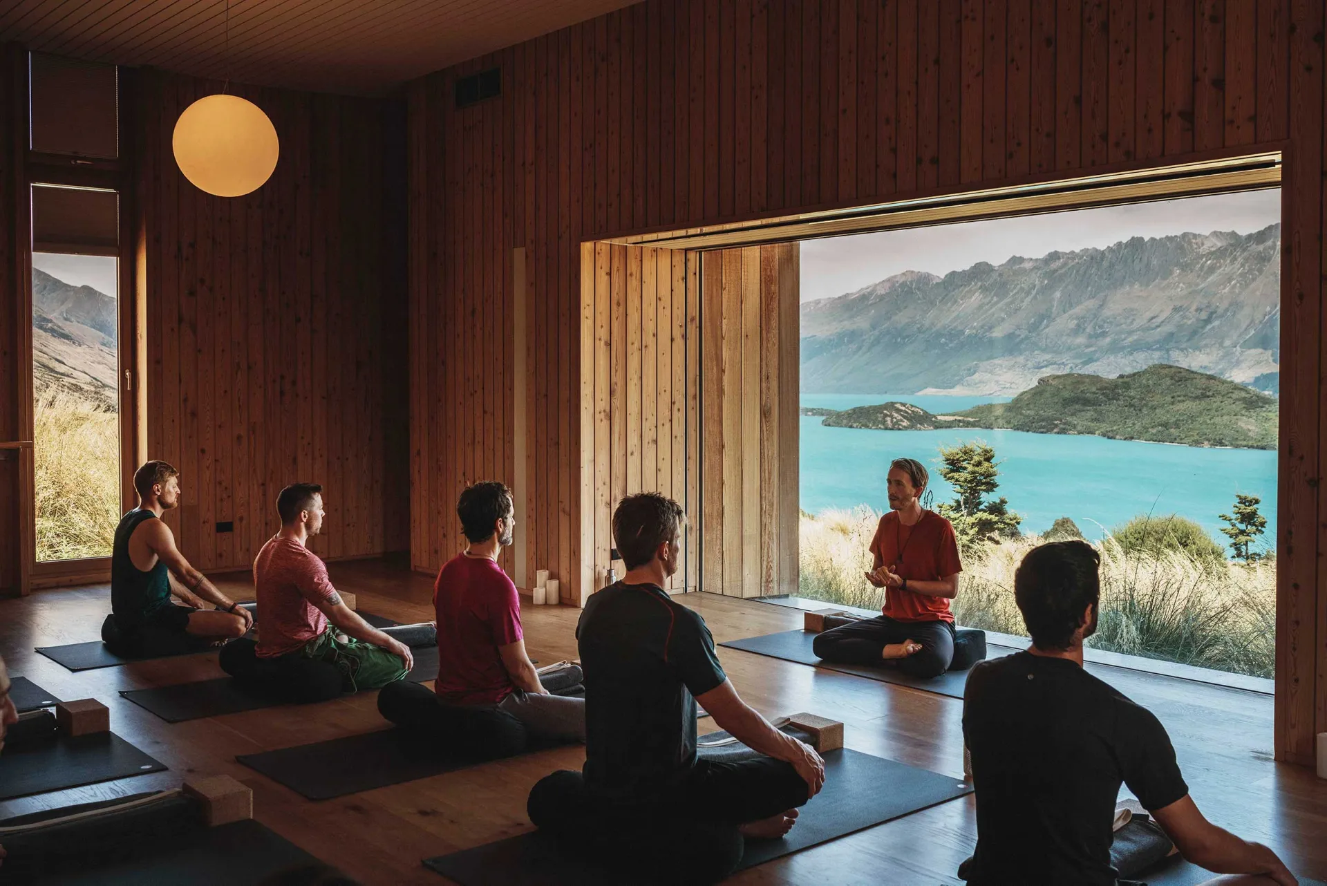
Here's me leading a Lululemon event at the world renowned New Zealand retreat, Aro Ha.
[The Problem]
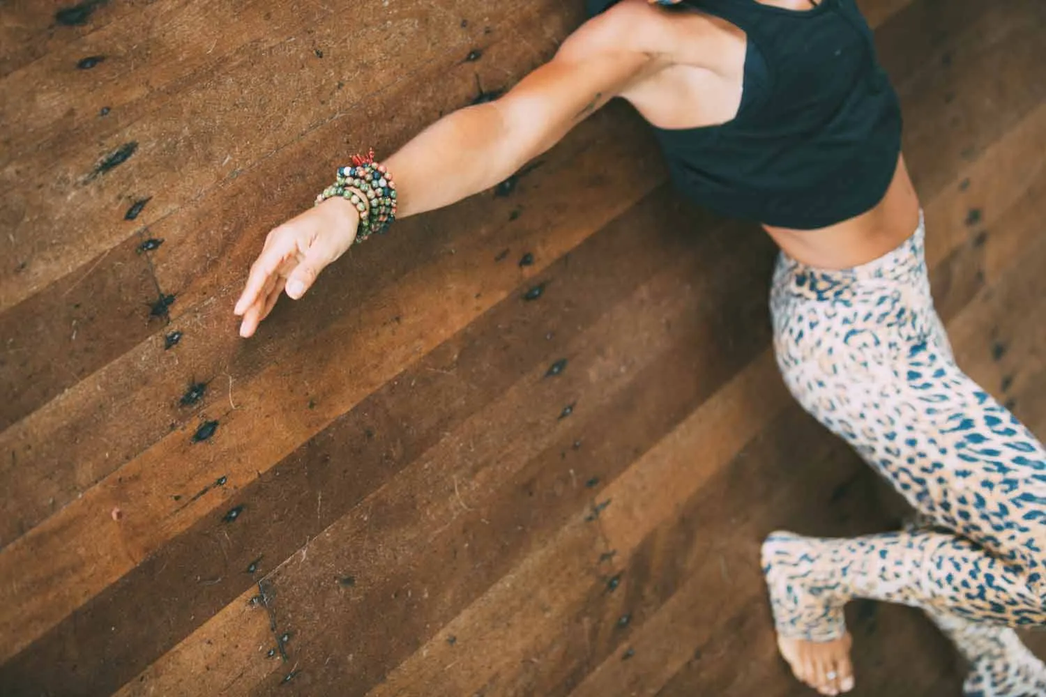
Something I hear from beginners almost every class: "I had no idea my body was doing that." Not about flexibility or strength, but about alignment. The basic fact is that they're in their own body, moving it through space, with very little sense of what's actually happening.
In a studio, I can walk over and quietly say "your left hip is dropping" or rest a hand on a shoulder to cue it back. That's really the whole job... helping someone feel something they can't directly see. But at home? You've got a phone propped against the wall and you're craning your neck sideways to check yourself against a video, which is the very alignment error you're trying to fix.
The apps that exist mostly make this worse. They give you someone to watch, not something to feel. And that neck-crank to see the screen breaks whatever you were trying to build in the first place.

[Discovery & Research]
I wanted to understand where the friction actually lived — the gap between rolling out the mat and actually feeling okay in the pose.
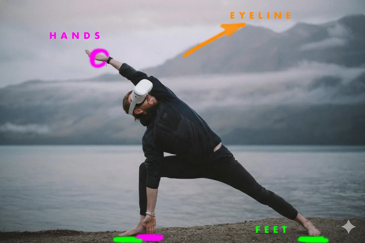
Auditing the top yoga apps first, and what came up immediately was the ergonomic failure. Every single one required users to turn and look at a screen to follow along. It sounds minor until you realise that breaking spinal alignment to check your spinal alignment is... well. I see it constantly with studio beginners too: they're watching the teacher instead of inhabiting the pose.
User interviews surfaced something I'd sensed but hadn't had confirmed: "looking stupid" was one of the main reasons people stopped going to public classes. As a teacher, that tracks immediately. It shaped the design lens toward Ahimsa — one of yoga's core principles of non-violence and compassion. The app needed to feel like a patient, supportive presence rather than a rigid critic.
Then from inclusive design research: every body is different. Range of motion, proportion, history. The onboarding needed to build a skeletal map unique to each user rather than assuming a "standard" body. The standard body doesn't exist.
[The pivot: from mimicry to proprioception]
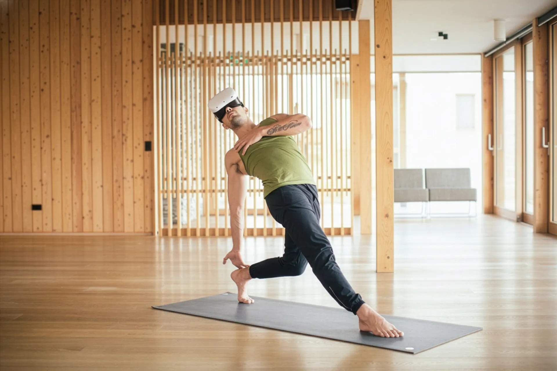
Early prototypes used a humanoid 3D instructor demonstrating poses. Technically clean, but it didn't work the way I hoped. Watching an avatar kept users in observation mode, copying an external image rather than actually occupying their own space.
This is actually one of the central problems in yoga pedagogy: students who fixate on watching the teacher stop listening to their own bodies. I was replicating that problem in software, which wasn't particularly useful.
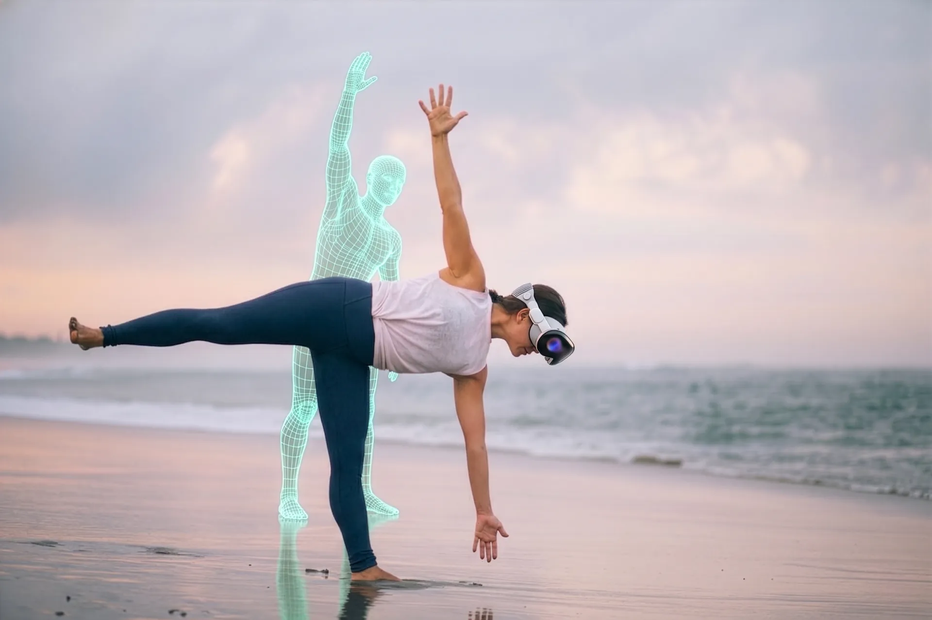
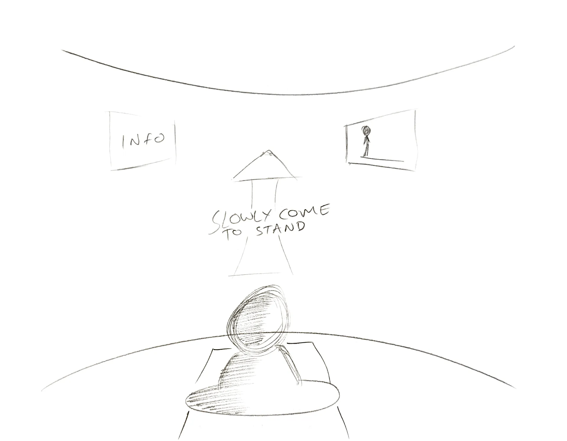
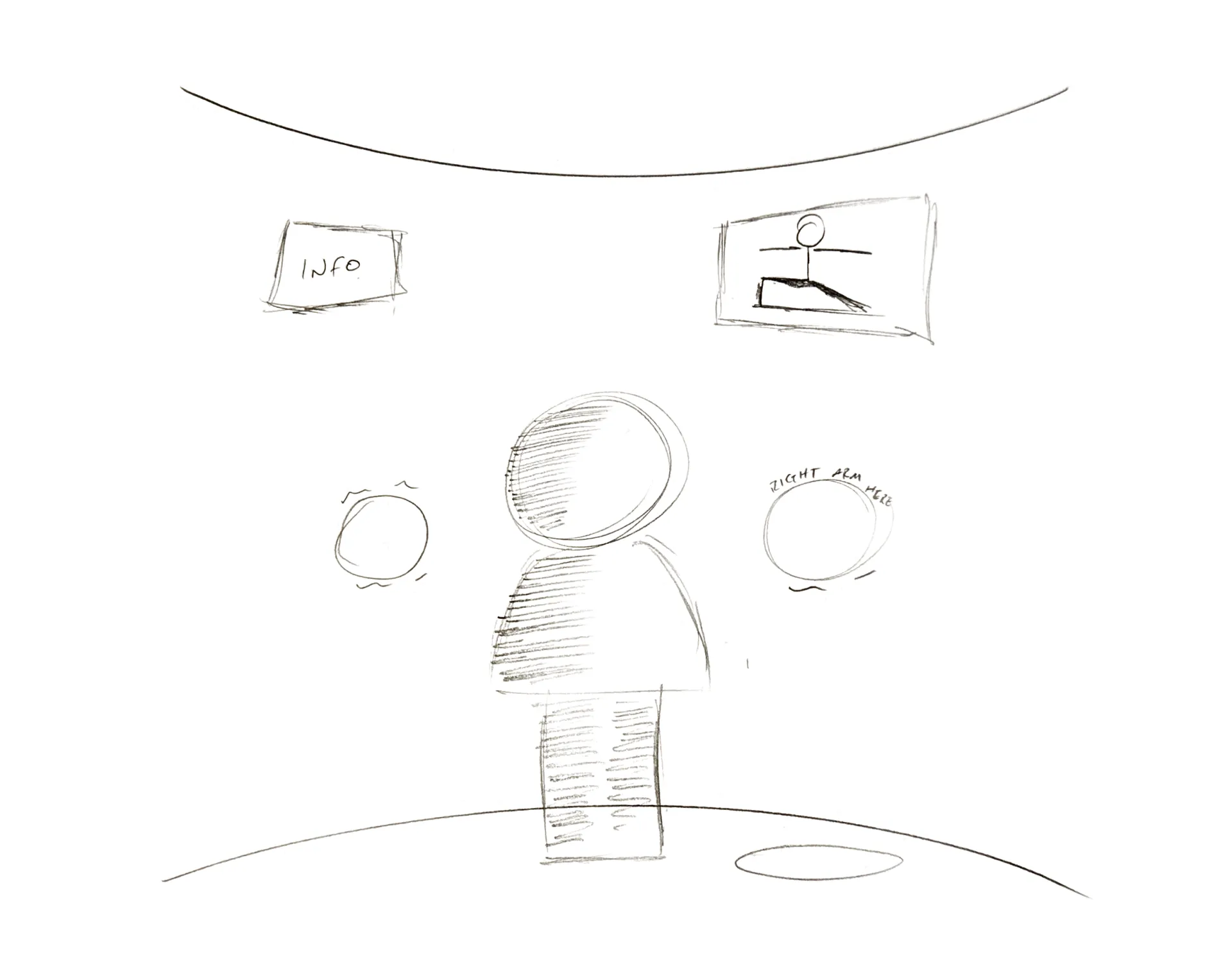
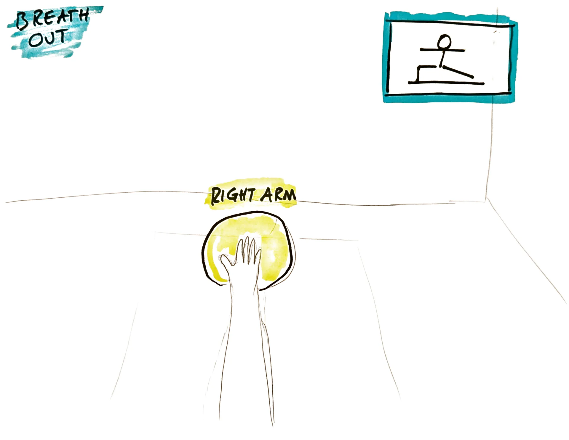
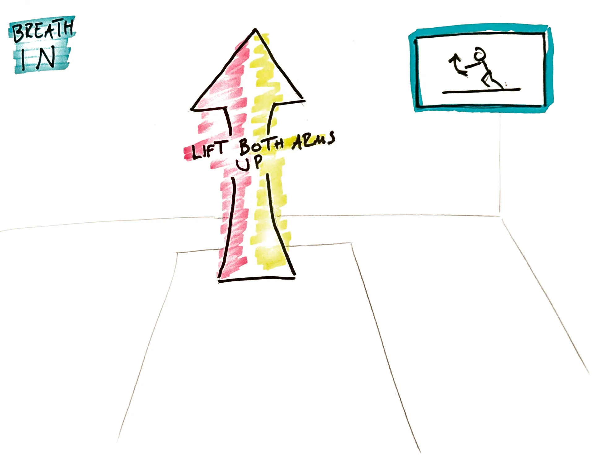
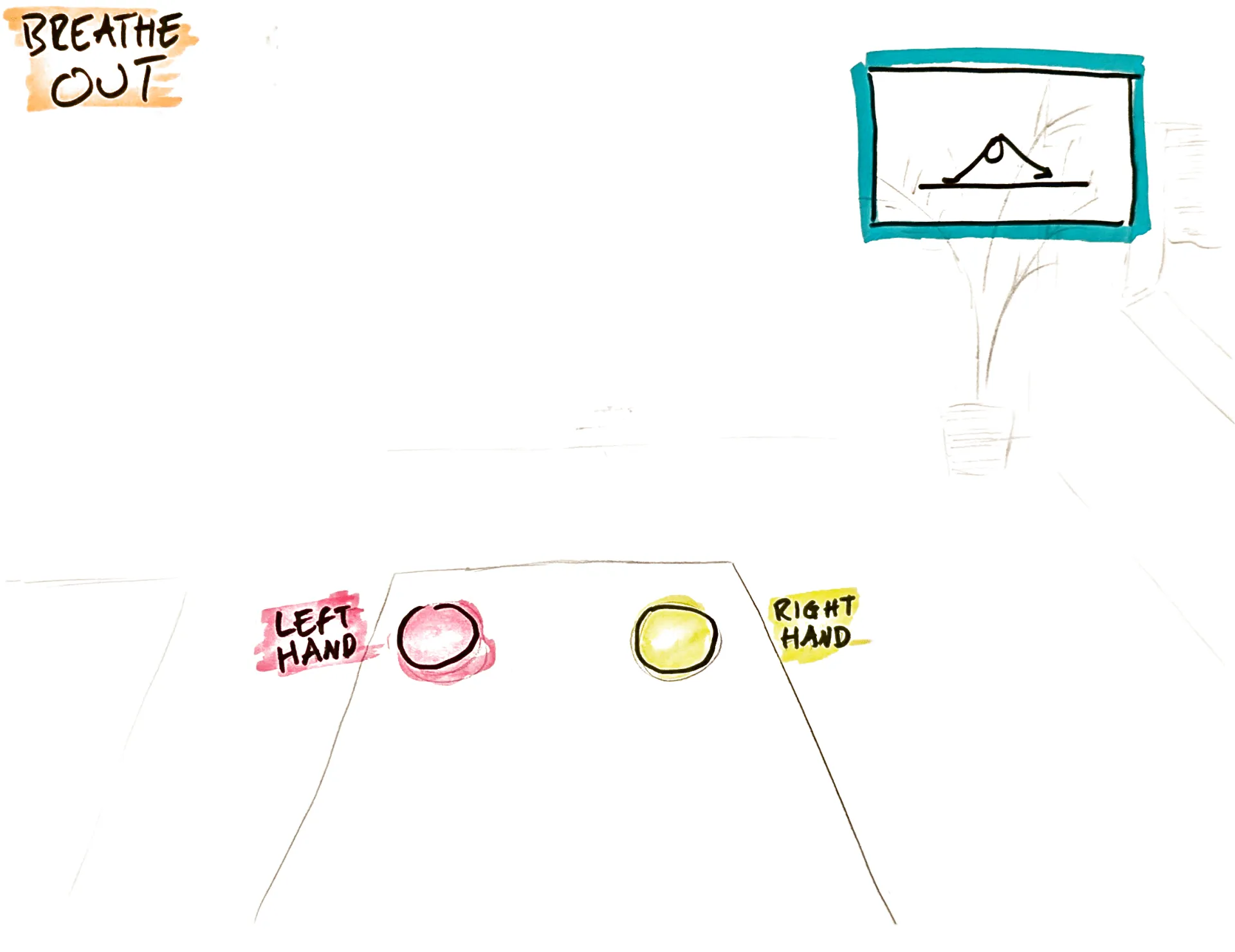
So the humanoid form went, replaced by abstract spatial signifiers — glowing "ghost" guides that appear in the user's actual physical space. Instead of watching someone else's arm, you see a soft target in your own space, where your arm should be. You're not watching the yoga. You're inhabiting it.
The design language that followed: proprioceptive feedback, spatial signifiers, calm tech principles, a peripheral body map as a quiet HUD, an earthy green success signal. All of it aimed at reducing observation and increasing felt experience.

[Design Decisions & Anticipated Iteration]
Three weeks wasn't enough time for simulation testing, honestly. But I could do heuristic analysis, and I could draw on years of watching beginners move through poses to anticipate where the design would first fall apart.
A Wizard of Oz approach is the natural next step: simulating AR instructions while users move through real poses, to see what actually breaks. Based on my best guess at what it'll surface first:
[Anticipated Failure]
Visual overload — too many glowing markers at once during transitions
Audio confusion — "move back" was frustrating when the user was inverted or sideways
Red stress — error colour triggered a "failure" response, breaking meditative flow
[Fix]
Sequential reveal: the app highlights only the primary foundation point before revealing the next marker
Spatial audio anchoring: verbal cues now come from the precise 3D location of the body part that needs to move
Amber buffer: a tiered colour system uses soft amber for "gentle adjustment," keeping the experience rooted in Ahimsa
[Design Goals]
These aren't measured outcomes. A 3-week sprint doesn't produce those. They're the targets that shaped every decision, and the things I'd test against first in the real world.
Three weeks is enough to prove a concept. It's not enough to exhaust one.
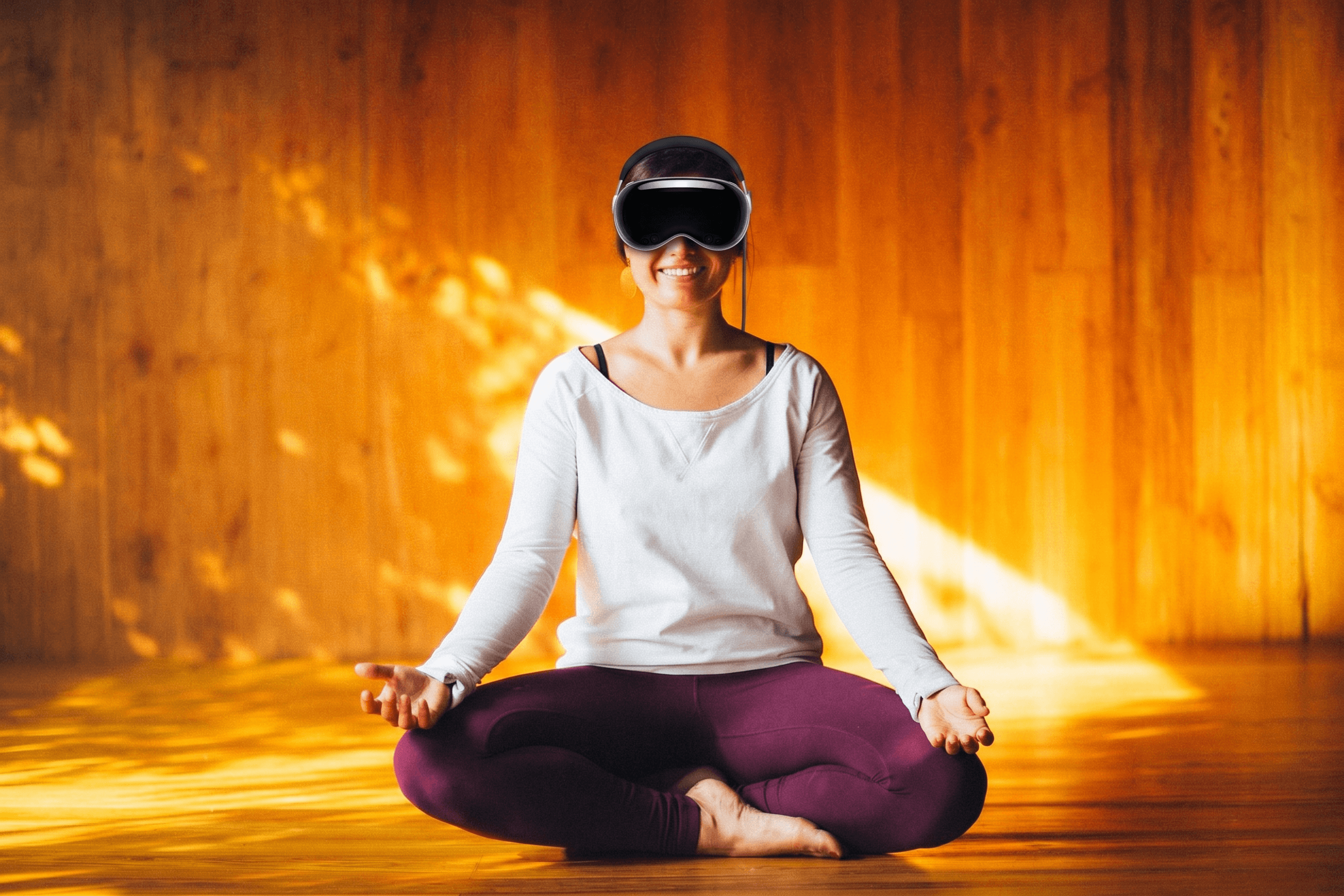
The core design holds up, I think, but there's a lot I'd want to put in front of real bodies before feeling confident in it. The Wizard of Oz sessions I didn't have time for. In-home research to catch real-time frustration that's invisible in interviews. Time on the actual hardware to understand device fatigue properly. And an eye on lightweight smart glasses as the likely long-term platform... Apple Vision Pro is a brilliant proof of concept, but it's still a headset you're strapping on.
What this project kept bringing back to me is that good yoga teaching and good UX design share the same fundamental challenge: you're trying to help someone build an internal sense of something they can't directly see. The tools are different, but the problem is the same. That felt like the right place to start designing from.